Poll Designer allows
you to create four different types of poll screens within your poll:
Information, Standard Input, HotSpot Input and Lead Input
screens.
- Information
screens do not ask questions or collect data. Instead, this
screen type is used to provide instructions or other information
to the respondent.
- Standard Input
screens use Windows-style buttons to record the respondent's
choices. As a result, the appearance and use of the screen should
be very intuitive to most respondents. These screens allow you to
ask multiple choice questions where the respondent chooses one or
more of the answers displayed.
- Hostspot Input
screens display an image with specific zones, called
"HotSpots", that act like buttons. To make a choice on these
screens, the respondent selects one of these Hotspots. For
example, a screen could contain an image of a map of countries
with each individual country identified as a HotSpot, and the
respondent could select his/her country of origin by selecting the
country HotSpot on the map.
- Lead Input
screens gather textual information from the respondent. The
respondent uses a virtual keyboard to enter text into one or more
input fields. These screens resemble a form in which the
respondent provides free-form answers to questions in the text
fields on the screen.
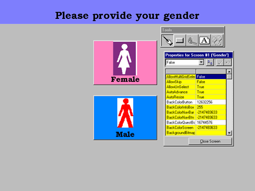
As you create or
edit a poll screen, Poll Designer enters design mode and displays a
full-screen view of the poll screen that you are currently designing
(figure 1). Therefore, you see exactly how your polling screen will
appear to your respondents as you create it.

Figure 1: Poll Designer - Design
Mode
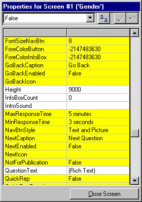
You control
the various properties of your poll screen and the elements (e.g.
buttons) on that screen through the Properties Grid (figure 2). This
tool allows you to dictate the look and layout of your poll screens.
Through the Properties Grid, you can specify:
- the visibility of
screen elements, such as buttons, question text, informational
text
- the look and content
of text on the screen and screen elements, including color, size,
format, font and alignment
- the graphics
displayed on the screen and screen elements
- the colors displayed
on the screen and screen elements
- the size and
location of screen elements
- the sounds played
when the screen first appears or the respondent selects
buttons.

Figure 2: The Properties
Grid
When modifying
individual screen properties, the Properties Grid provides intuitive
dialog boxes that make the design process easy. You can control
minute details of your screen's appearance without any programming
experience or knowledge.
Return to Poll
Creation.
|

